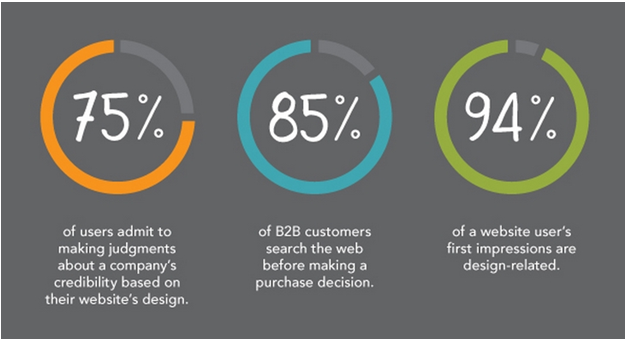
It only takes 50 milliseconds for a visitor to decide whether they want to stay on your website or not.
You spend months sourcing the right products, writing an excellent copy, and offering exceptional customer service – yet you will be judged in these 50 milliseconds. Sad, but true.
The truth is that the first impression matters in the eCommerce business and your eCommerce website’s design will help create it.
Paying attention to the design of your eCommerce website is crucial. Otherwise, it can take a silent toll on your business in the form of opportunity lost.
Why Does the eCommerce Design of Your Website Matter?

Imagine if a new visitor lands on your eCommerce website, but its design is not catchy – you will lose out many potential customers, which is something you would not want.
Here are two other ways the design of your eCommerce website can impact your business:
- Your eCommerce web site’s design can improve its conversion rates. Even the slightest changes in the color or the text of the ‘Buy Now’ button can lead to more conversions.
- Design plays a crucial role in ADA compliance. A brilliant design ensures your website is readable, and even people with visual disabilities can access it.
A brilliant website design can help you connect deeper with your customers, spread brand awareness, and boost repeat sales.
Six Best eCommerce Web Design Practices to Enhance Your Conversion Rate
Here are a few tried and tested tips that can help you improve your eCommerce website’s design:
1. Sell Your Unique Value Proposition

When all eCommerce brands appear nearly the same, a unique value proposition will help you differentiate yourself. It will tell customers why they should choose your store over hundreds of stores and increase conversions. So, spend some time figuring out the USP of your eCommerce brand and knowing how you can represent it in the best way possible.
Here’s how you can understand your USP:
- Ask yourself: What is it that you do but your competitors don’t? Are you solving a unique problem? Are you offering better service or quality?
- Interview your existing customers on what they like the most about your brand.
Once you have figured out your USP and displayed it on your site, you will be surprised how efficiently your conversions will improve.
2. Feature Your Best Products on the Homepage

Your website’s homepage is your chance to recommend what customers should buy from your website. So don’t miss that chance and don’t recommend products you wouldn’t buy.
Use this opportunity to recommend your best products, and if there are new products in your collection – display them down the page.
To know which products you should showcase, you can run A/B tests on your website or just display the ones that have the maximum demand.
3. Keep Your Website Simple & Concise

To design a catchy eCommerce website, think from your target audience’s perspective. Ask yourself: Can I easily find what I am looking for? If not, it needs to rework.
Great eCommerce websites are easy to scroll, easy to search, and solve the purpose of going online for your business. So, keep the website design clean and simple.
Here are a couple of things you can do:
- Carefully utilize the white space. Don’t under or over-utilize it.
- Don’t use more than three website colors per page.
- Choose a simple and readable font. It will ensure your content is scannable.
- Highlight crucial information with bullets, short paragraphs, and bold typeface.
- While using a grid layout for displaying products, limit a row to display up to three or four products to maximize its visual appeal.
4. Ensure Your Website is Mobile-first or Mobile-responsive
Most website visitors (around 58%) these days are mobile users. Hence, it is essential to ensure your eCommerce website is mobile-responsive and offers a consistent experience across all browsers and devices. Make sure your website sections’ padding and margins do not disappear on smaller screens. Also, font sizes and line spacing should adjust automatically according to the white space on the screen.
Besides, your website should load fast. Mobile users want things quickly. Even a slight delay of 0.1 seconds can cost you around 8.4% conversions.
Important Tip: View your eCommerce website on different devices and operating systems, not just one. It will ensure you’re prepared no matter which device your website’s visitor uses.
5. Offer User-friendly Navigation
Complex navigation is one of the primary reasons for shopping cart abandonment. Ensure that the navigation is effective and user-friendly.
Here are a couple of things you must keep in mind:
- Display your main navigation menu on your website’s top. Also, keep each section well-organized.
- Always keep your logo in sight. It should lead the user to the homepage.
- Include a search bar to help users easily find what they’re looking for. It should have auto-complete features and other relevant filters.
- Each website should have a CTA button.
- There should be breadcrumbs on your product pages so that they can return to categories and subcategories if they want.
6. Use High-quality Images
Each image evokes a particular emotion. If an image is not well-optimized, things will not be in your favor. High-quality images increase conversion and low-quality images reduce it. Hence, you should use high-quality images for your products.
Use 360-degree product images as customers want to see a product from every angle before purchasing. They also increase conversion by 40%. Besides, high-resolution images also build confidence between you and your customers.
Here are a couple of things you should keep in mind::
- Create slideshows to showcase your product from different angles
- Enable zoom so that customers can see fine details of your product
- Optimize product images for both mobile and web
- Use lifestyle images instead of plain product photos. They look more appealing.
Conclusion
Design is the most crucial aspect of an eCommerce website, especially when 42% of customers say that they abandon websites with poor functionality. Hence, always start with the design of your website. If it’s not up to the mark, fix it as soon as possible.
Hopefully, the eCommerce design tips we shared above will help you design your website to earn maximum revenue. Still, if there are any queries, feel free to share in the comments.


